PRINT DESIGN
This section showcases a diverse collection of work spanning automotive brands, pro-bono initiatives, and personal creative explorations. Each piece reflects a deep commitment to storytelling through visual artistry—whether through photography, illustration, or design. From directing large-scale productions to crafting imagery firsthand, my role has been to shape compelling narratives that resonate. This body of work is a testament to the power of creative direction in bringing ideas to life, blending strategy with artistry to make every project visually and emotionally impactful.
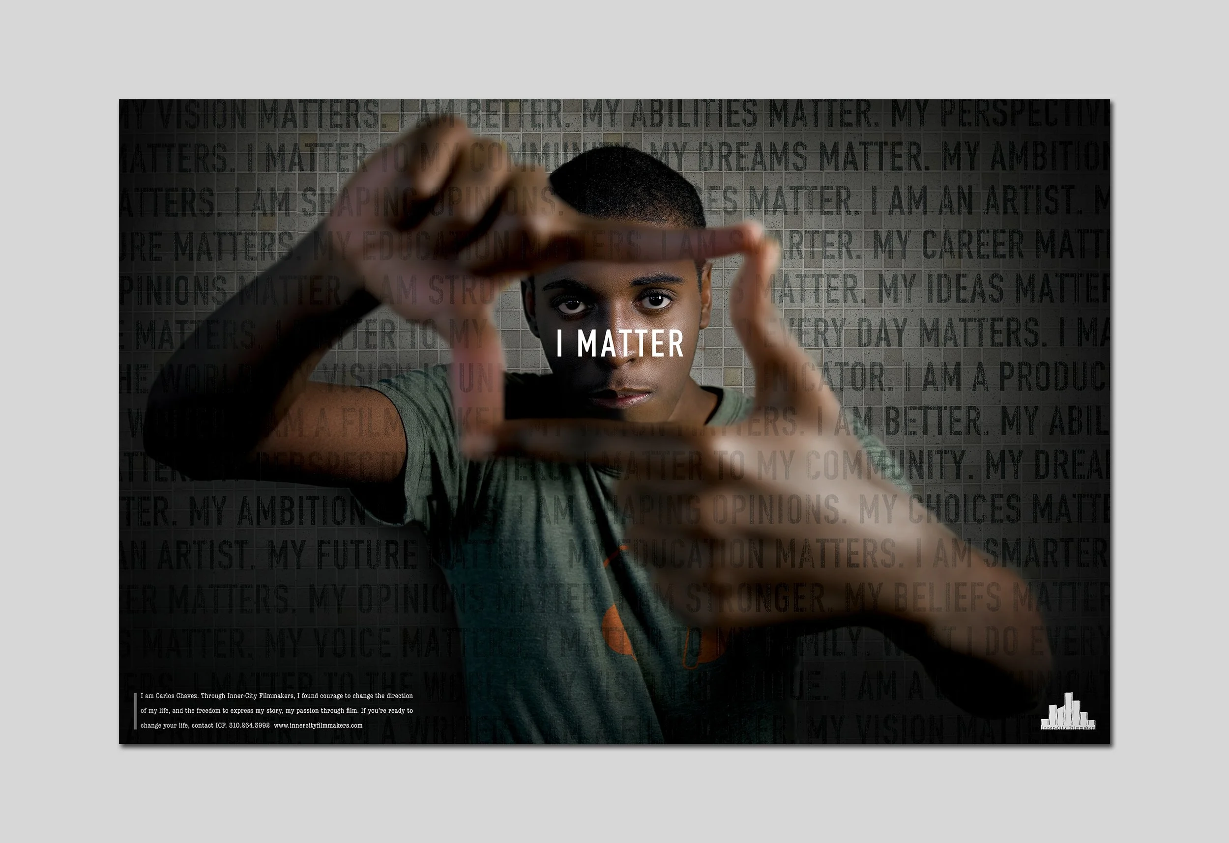
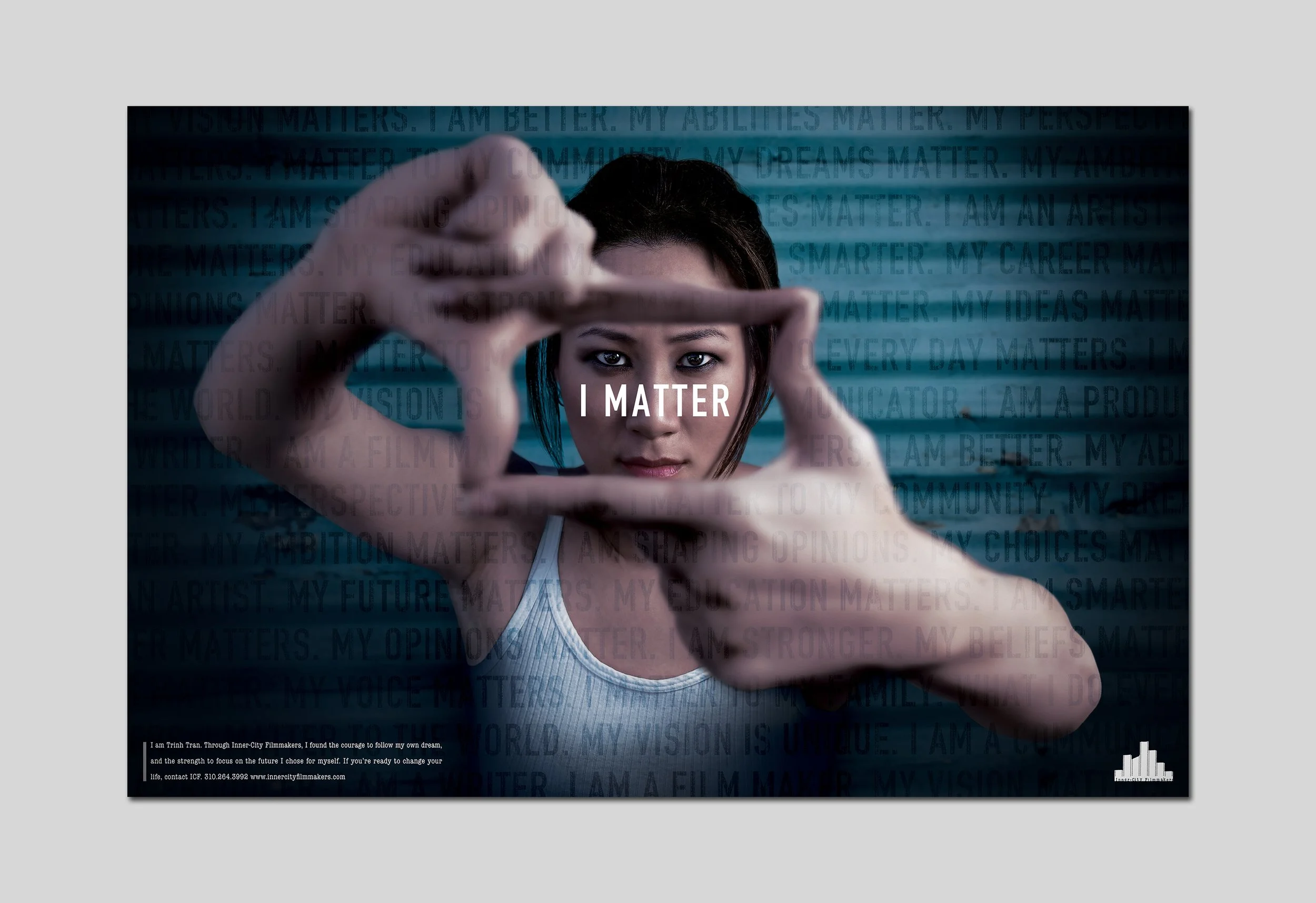
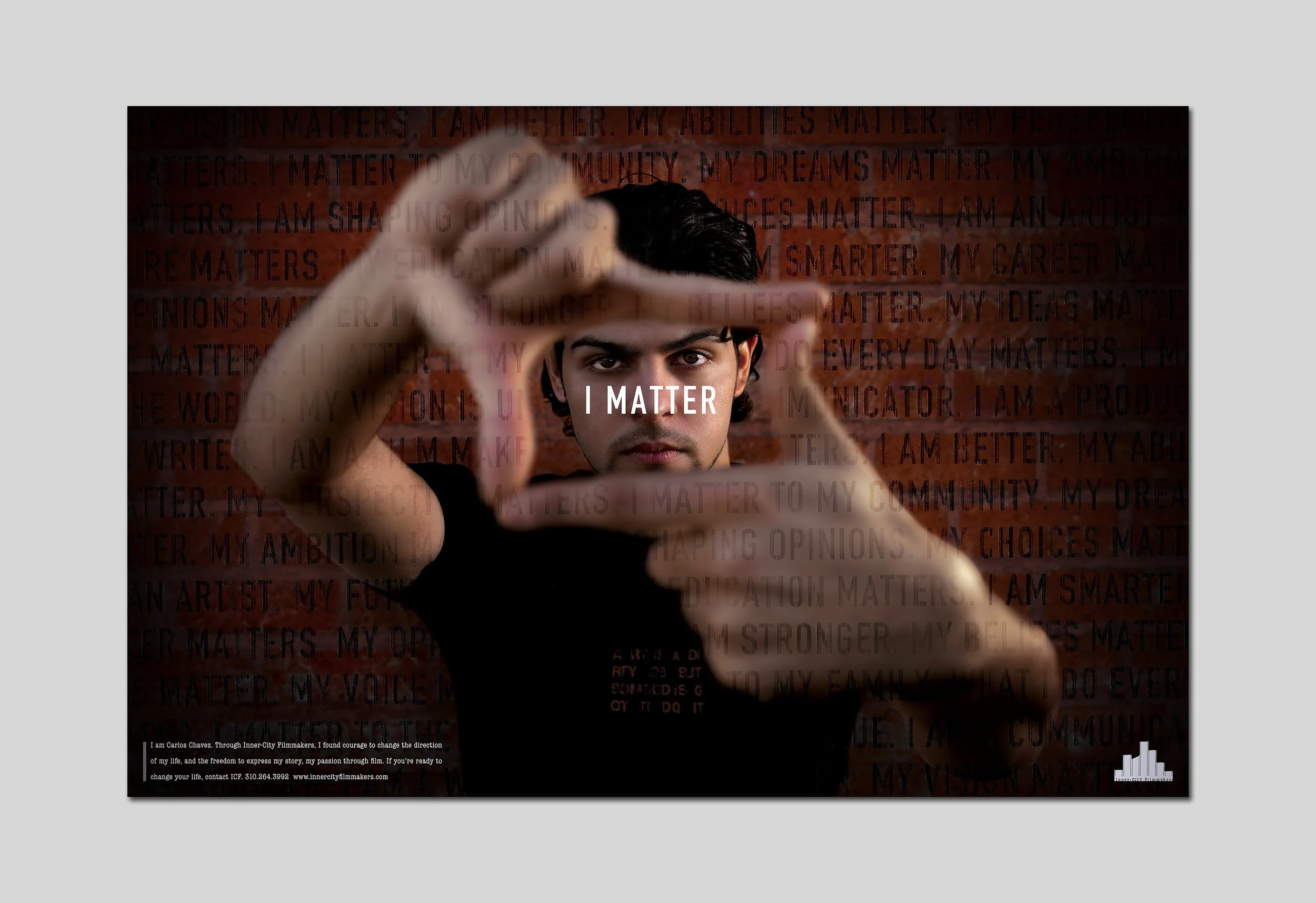
This series of pro-bono posters and mailers was created for Inner-City Filmmakers, a non-profit organization dedicated to mentoring and training marginalized, low-income youth with a passion for filmmaking. More than just a program, Inner-City Filmmakers provides these aspiring storytellers with the tools, guidance, and opportunities they need to break into the industry and shape their own futures. The campaign was built around the concept: “Thousands of Stories, Same Ending.” Each execution featured a graduate of the program alongside their personal journey—unique challenges, different beginnings, but all leading to the same powerful outcome: a future in film. These pieces didn’t just raise awareness; they gave a face to the success stories, proving that with the right support, talent and determination can lead to incredible possibilities.
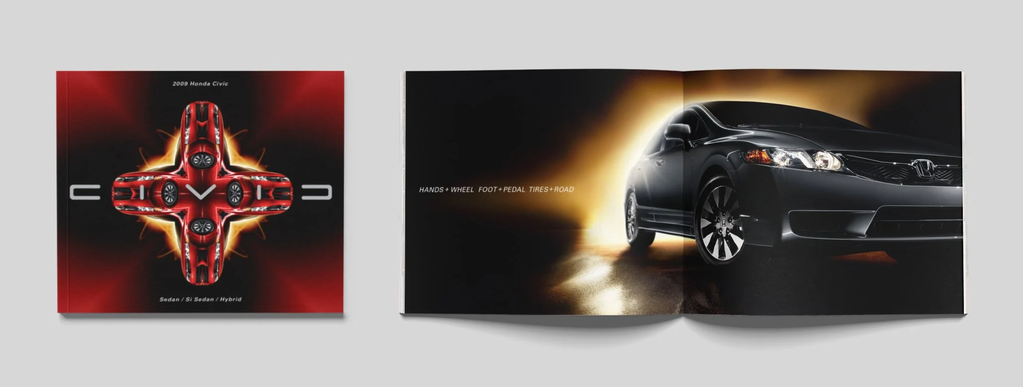

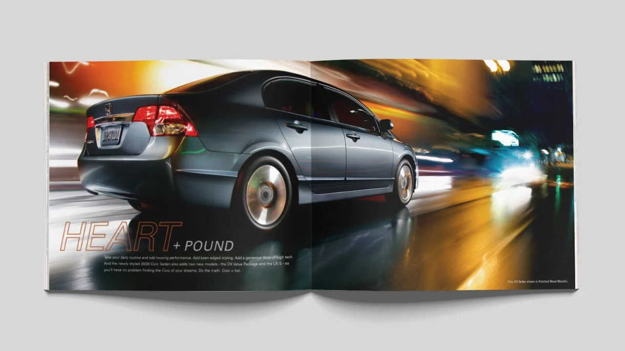
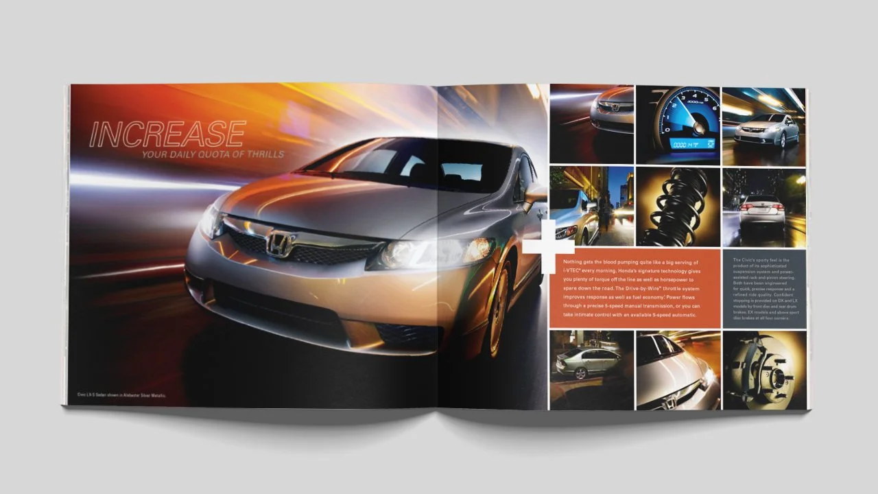
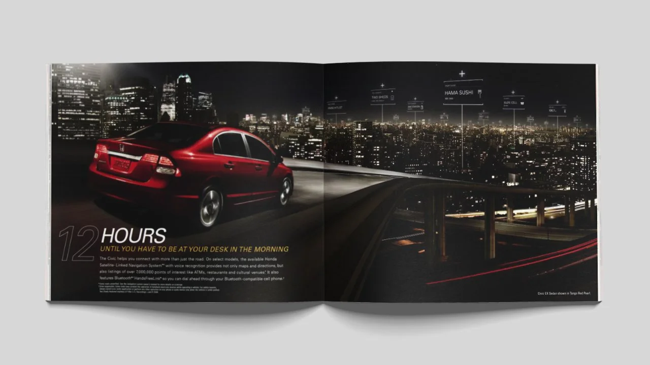

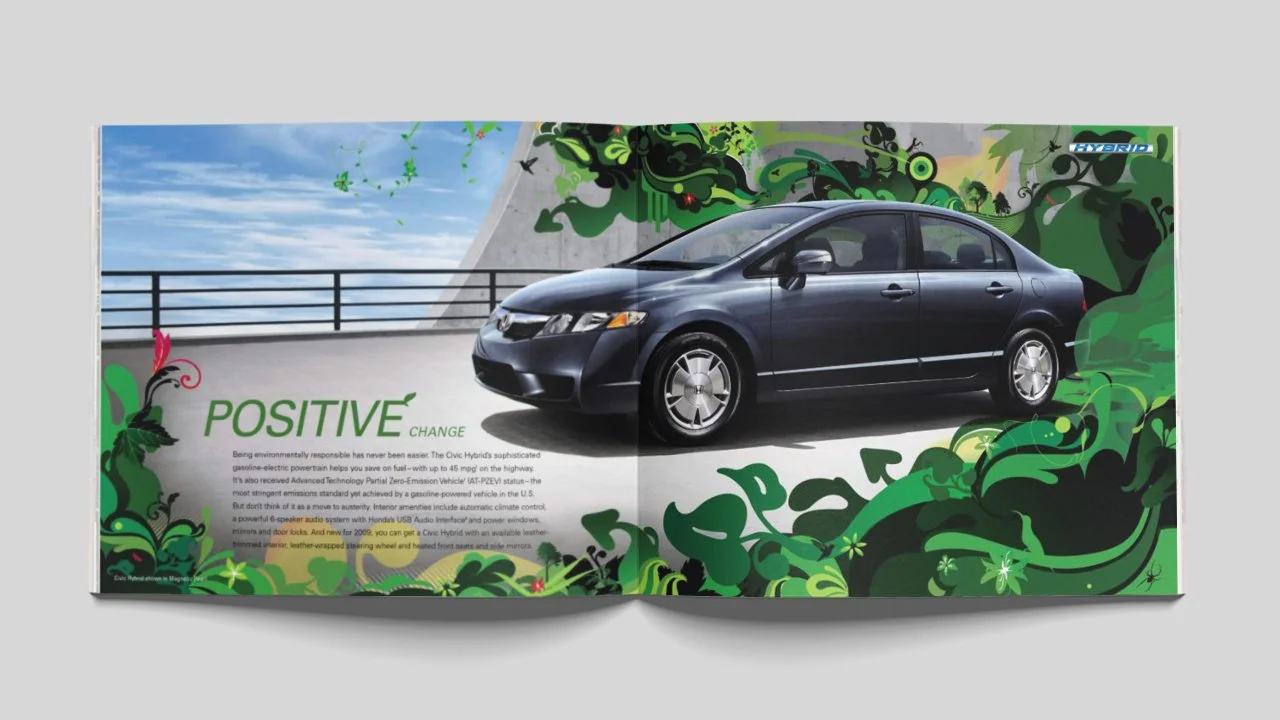


At its core, this piece is built around a simple yet powerful idea: the Civic is a catalyst, waiting for a driver to spark the reaction. The moment they come together, the journey truly begins—roads open up, experiences intensify, and every mile becomes an opportunity for discovery. This concept is woven throughout the book, brought to life through a rich visual language. Warm, dynamic colors infuse energy into every page, while bold, expressive typography and striking illustrations reinforce the sense of movement and excitement. Every design choice reflects the transformative power of the Civic—turning the ordinary into something extraordinary.

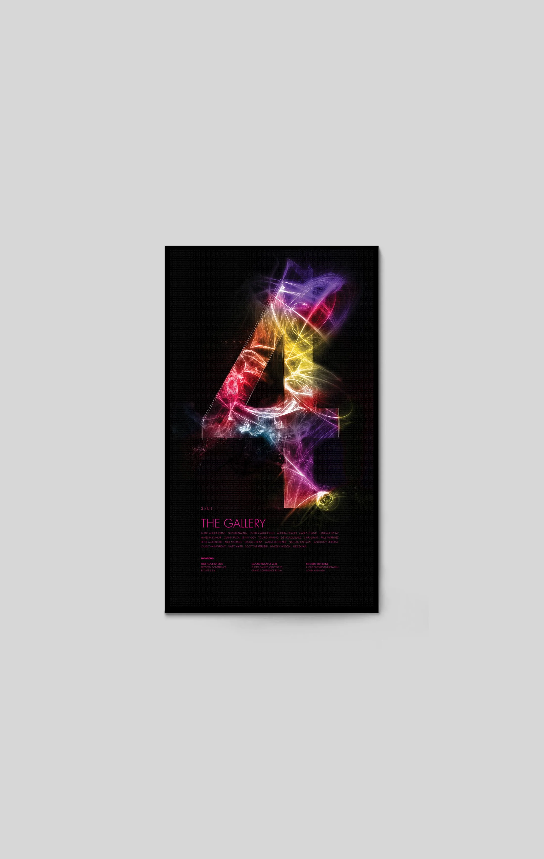
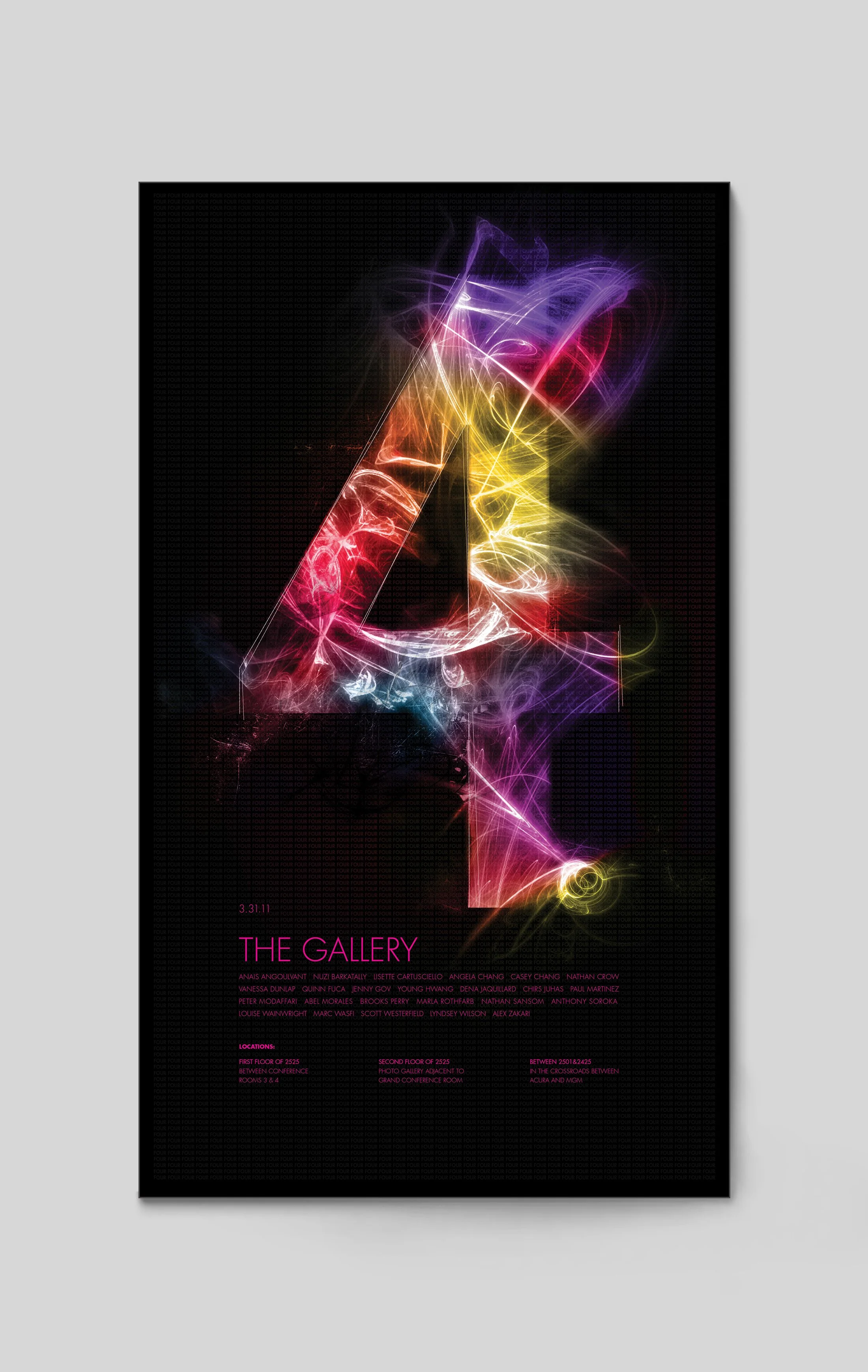
Once a quarter, the advertising agency RPA hosts a gallery show—but with a unique twist. The majority of the exhibitors aren’t from the creative department. This event is a celebration of the diverse creative spirit that exists throughout the agency, bringing everyone together to showcase and appreciate artistic expression in all its forms. This poster was designed as a visual embodiment of that idea. The number 6 is constructed from hundreds of different fonts, each set at a delicate opacity. Individually, they may seem subtle, but when layered together, they form something vibrant, dynamic, and greater than the sum of their parts—just like the collective creativity of the agency itself.


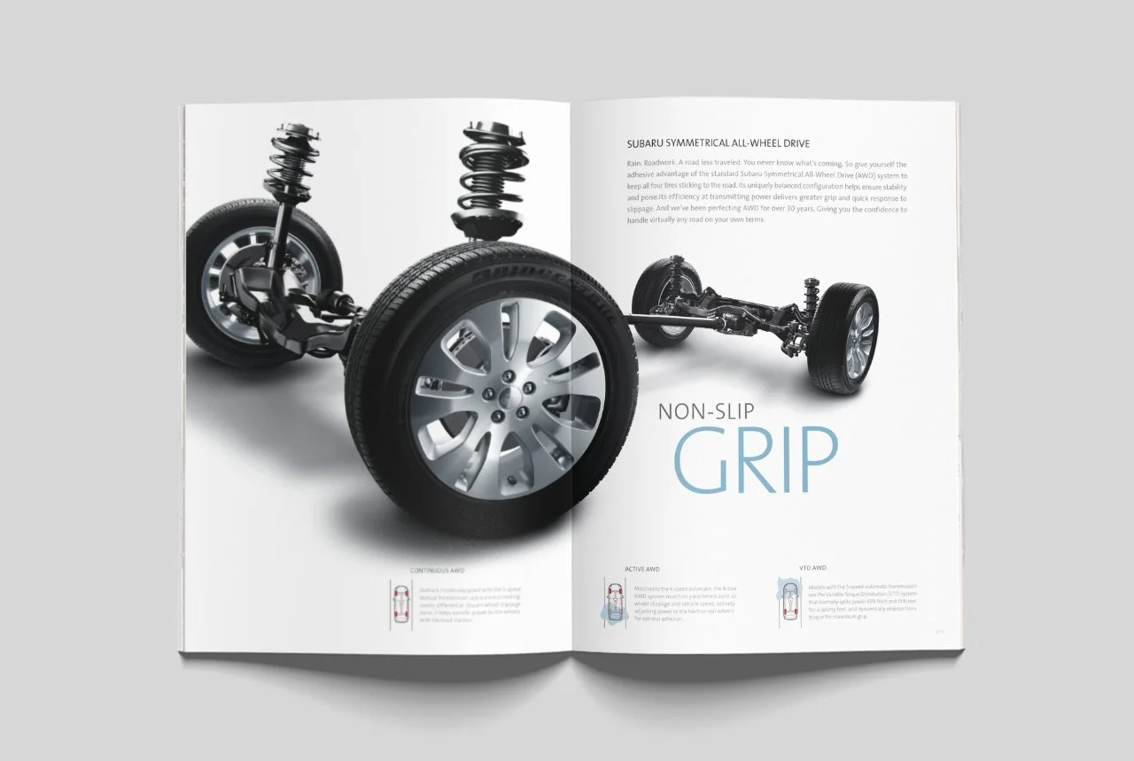

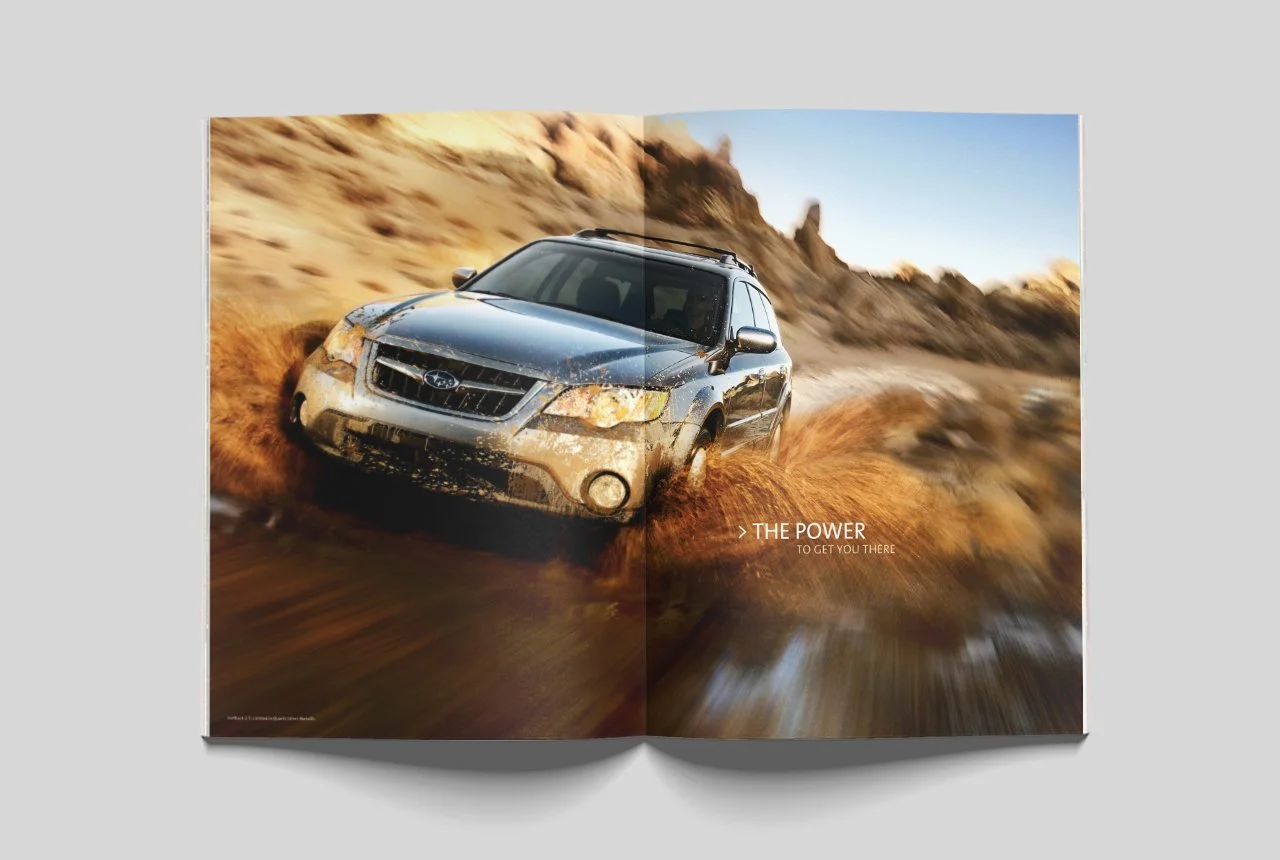
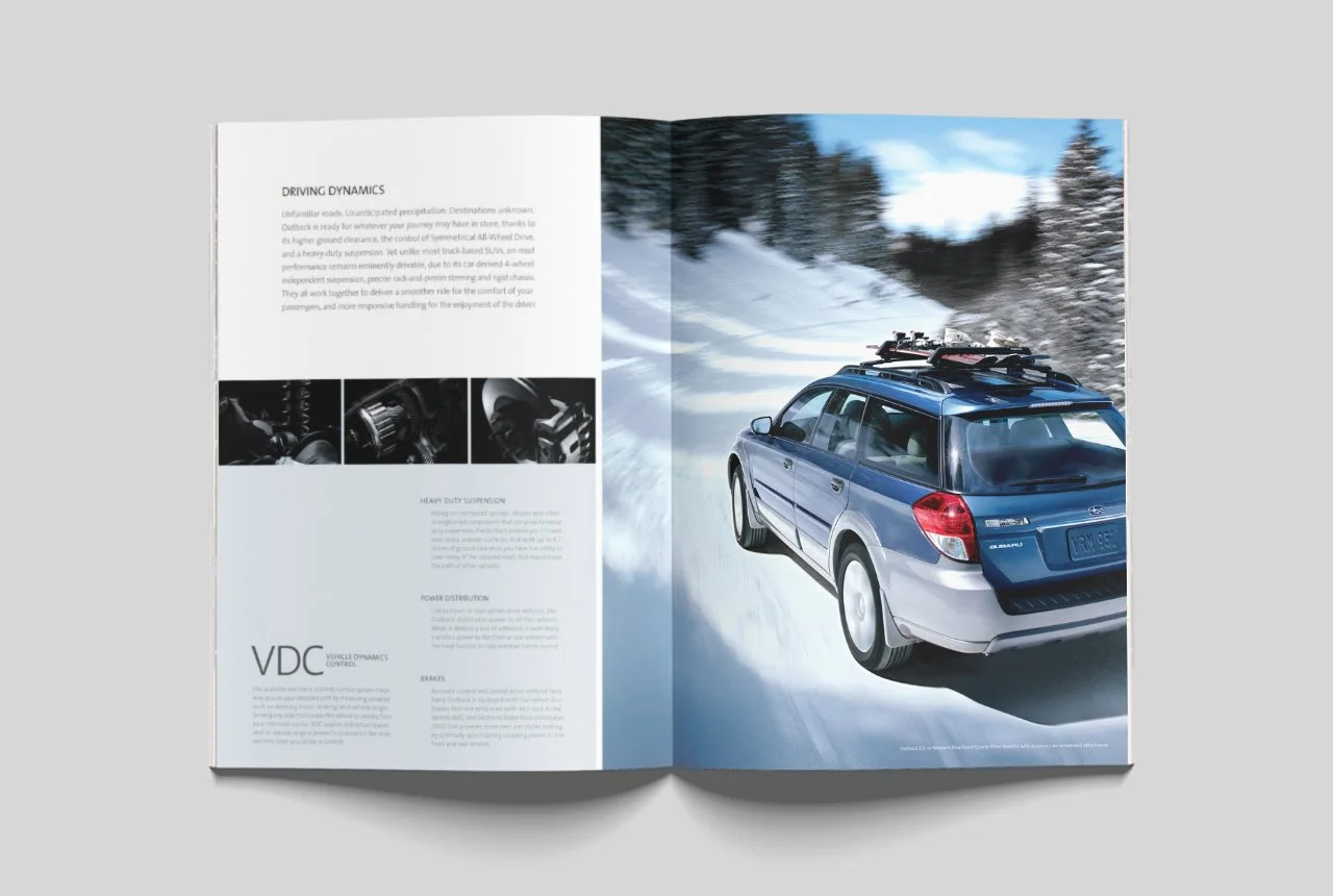
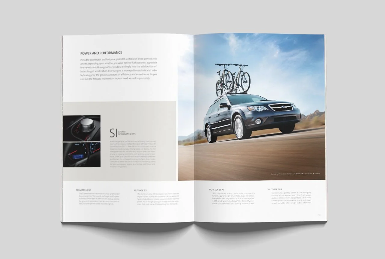
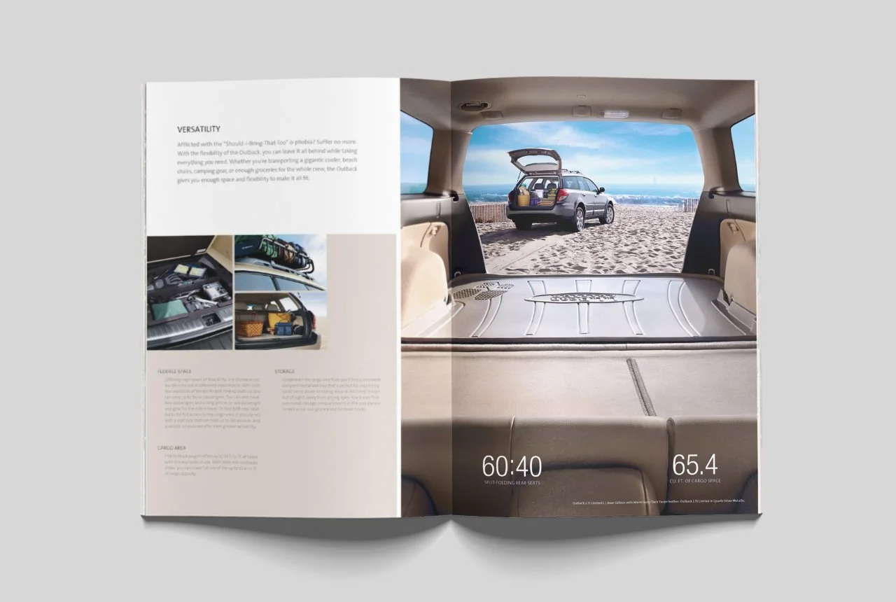


This was the first brochure to showcase Subaru’s tagline: “It’s what makes a Subaru, a Subaru.” We introduced the idea on the Z-fold with “Ready for Adventure – It’s what makes a Subaru, a Subaru” and carried it through the book using lush, full-color imagery to reinforce the message: traction, safety, and power—all key elements that help make a Subaru a Subaru. The feature presentation was structured around Subaru’s three core technological pillars: the Boxer® engine, Symmetrical AWD, and advanced safety.

With the launch of the Infiniti Q50, the brand introduced a groundbreaking innovation: Direct Adaptive Steering. This revolutionary technology replaced the traditional mechanical steering connection with a fully digital system, making it the world’s first true drive-by-wire steering system. It wasn’t just an evolution—it was a complete reimagining of how drivers connect with the road. However, with a complex story to tell and a limited advertising budget, Infiniti needed a way to educate consumers on what made this system so advanced and why it mattered. I led the creation of the above infographic as a key piece of a larger social media campaign, distilling intricate engineering into a clear, compelling visual narrative. The piece was also printed as posters and used in dealerships as point-of-sale material, helping to translate cutting-edge technology into tangible benefits that resonated with potential buyers.

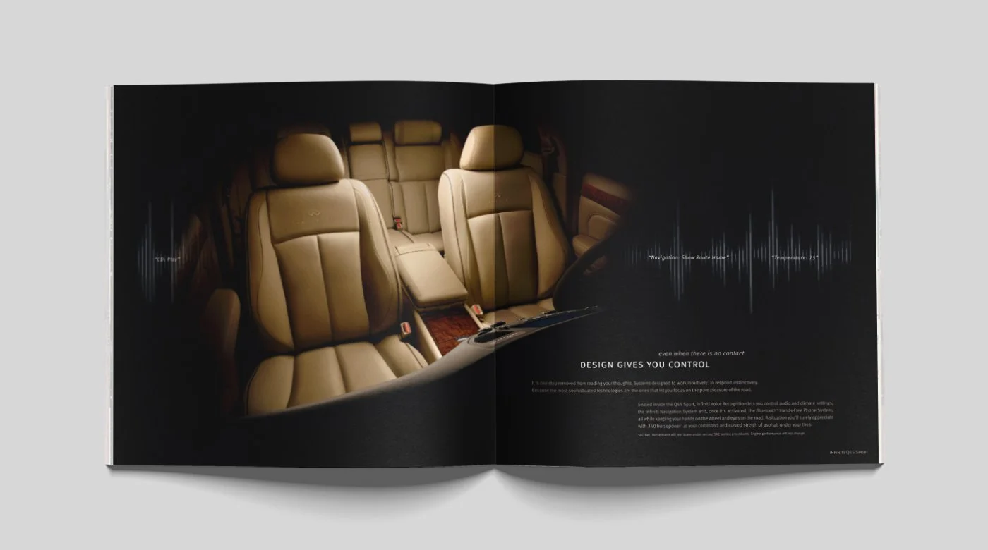

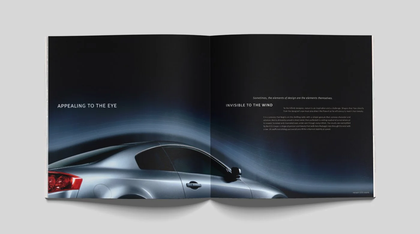

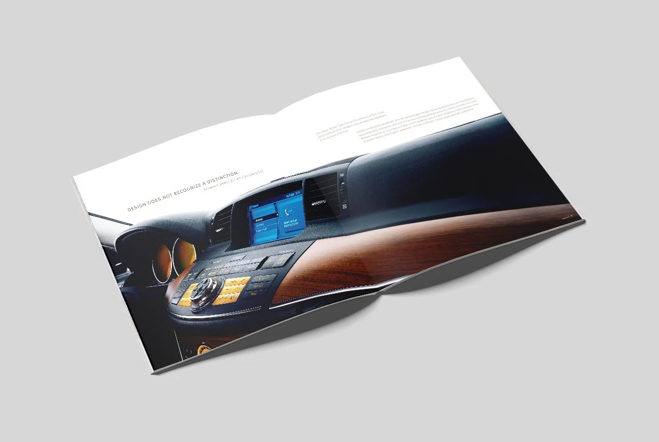


Traditionally, the Infiniti brand brochure served a straightforward purpose: to present the full range of available vehicles—nothing more, nothing less. But as the most widely distributed print piece in Infiniti’s portfolio, it had the potential to do so much more. It wasn’t just a catalog; it was an opportunity to elevate the brand, deepen engagement, and redefine how consumers connected with Infiniti’s design philosophy. I reimagined the brochure as more than just a lineup of cars—it became a storytelling piece, where each vehicle offered a unique perspective on Infiniti’s approach to design. The G Coupe wasn’t just sculpted for aesthetics; it was shaped to slip invisibly through the wind. The G Sedan’s acceleration wasn’t just powerful; it was engineered to feel endless. Through this lens, I showcased that for Infiniti, design isn’t just about how a vehicle looks—it’s about how it moves, how it feels, and how it transforms the driving experience.