
HONDA MOBILE REDESIGN
In its 2013 survey of automotive manufacturer mobile sites JD Power and Associates scored the Honda site poorly compared to its competitors. Honda took this as the impetus to take a fresh look at its mobile property and came to us with a simple brief: Give the site a complete overhaul to improve both the user experience, and to increase their score in the next years JD Power testing. We started by rethinking the entire experience from a mobile first perspective, creating a simpler more intuitive interface and streamlining paths to the most important content. In addition, we added larger more compelling product photography, videos, and 360’s. The end result was both an improved customer experience and a score that was much more favorable in the year that followed.

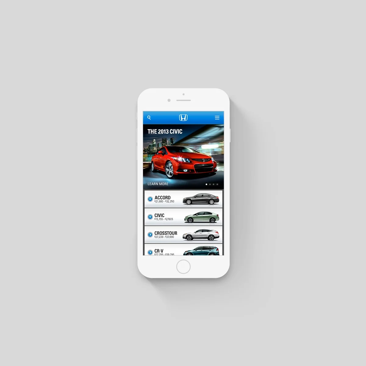
The landing page was developed to quickly aide consumers in finding the right vehicle. This was achieved in two ways; the first was organizing vehicles alphabetically by name to help consumers who were already interested in a specific model to find it. The second was to show each vehicle in profile with its MSRP range, enabling consumers to quickly find the right body style and price point. Vehicles with multiple body styles had an accordion menu that deployed on tap to reveal all body styles for that car. Clicking the menu icon at the upper right deployed a main menu with quick links to all shopping actions as well as quick links to every vehicle on the site.

Vehicle landing pages were designed to quickly surface the most relevant items using a tabbed system under the main image. In addition, we exposed the shopping information first enabling consumers to quickly understand a vehicles pricing by trim level and compare features between trims using an expandable accordion menu.